

Design Systems ♡ Lovable, Bolt, V0 and Replit.
A practical guide to integrating UI libraries, brand assets, and design tokens in AI-generated prototypes


AI prototyping tools like Lovable, Bolt, v0, and Replit let you rapidly spin up apps, but speed isn't enough if the results don’t fit your product. Most teams aren’t starting fresh; they’re bound by existing brands, design systems, and constraints. Over the past few weeks, I tested how well these tools integrate with real-world design systems, reusing your assets and styles. Imagine quickly prototyping features that feel like natural extensions of your existing product, without needing developers. Dream come true!
Enabling AI tools to work with existing Design Systems felt like the key unlock for real adoption inside companies with established assets.
Table of contents:
Part 0. Let’s talk defaults.
Part 1: Applying brand styling (tokens, Tailwind config, fonts)
Part 2: Integrating open-source UI Component Libraries
Part 3. Your custom Design System
Part 4: Tool-by-tool breakdown
Part 0.
Let’s talk defaults.
Most AI tools default to a React + Tailwind + ShadCN stack. That combo makes sense: it’s flexible, familiar, and modular. But it can feel generic or misaligned with your product. Let’s explore how to shape it to match your real system.
Let’s quickly break down each piece:
React
A popular open-source frontend framework for building user interfaces. It’s how we write functional HTML, CSS, and JavaScript in a way the browser understands.
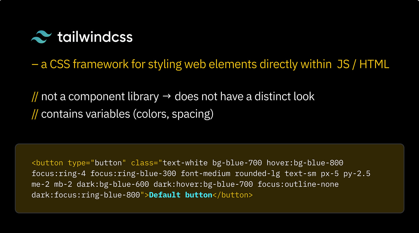
Tailwind
A utility-first CSS framework. Unlike a UI kit, Tailwind doesn’t give you pre-styled components — it gives you low-level utility classes to style your elements directly in HTML or JSX.
So when someone says, “AI-generated apps look like Tailwind” — that’s a misunderstanding. Tailwind has no inherent visual style. It just gives you the building blocks. That said, Tailwind does define the design tokens (spacing, colour, typography, etc.) that shape the look of many interfaces built with it.
ShadCN
A component library built for React and styled with Tailwind. ShadCN stands out because of its flexibility: you can pull in just the components you need, and they live inside your codebase — fully editable, easy to theme or extend.
This is a big shift from libraries like MUI, which come with baked-in design decisions and global imports. For example, MUI enforces things like floating labels by default, which can be hard to override.
Yes, ShadCN components have a default visual style — shadcn/ui comes styled with Tailwind utility classes out of the box — but that’s just a starting point. With a bit of effort, they can look unique. If you see a generated app with the “ShadCN look,” it just means the prompter didn’t customise the styles.

Bonus: Icons
Most tools using this stack also default to Lucide icons — an open-source set of over 1,000 SVG icons, clean and developer-friendly.

So these are the defaults. Let’s see what we can do about them.
Part 1:
Applying brand styling (tokens, Tailwind config, fonts)
If your company has a brand (maybe even a few), then it likely comes with a defined visual identity: colours, fonts, styles, illustrations, and tone.
Your marketing or brand team probably documented this in a brand manual , outlining what’s allowed, what’s not, and how to stay consistent. They treat it seriously, and for good reason: it’s about protecting brand integrity.
In product, those same rules often get adapted. You’ll usually see subtler fonts, toned-down visuals, and more functional iconography.
Let’s call this group of choices style guidelines. These usually include:
Colour palette (primary, secondary, text colours, etc.)
Font family and weights
Spacing system
Border radius rules
Shadow styles
This is easy to adapt. You can get a lot of visual consistency just by applying your existing style tokens across the board.
Here are practical ways to apply your brand styles in AI prototyping tools like Bolt, Lovable, v0, and Replit:
1. Use the project’s Knowledge or Context
Each tool has a global context field:
Bolt, v0, and Lovable call it Knowledge (found in Project Settings), Description in Replit
v0 also uses Context (set during project creation, also editable later in Project Settings > Knowledge)


This is where you can paste your brand styles:
A list of variables with standard naming (like
-primary-color,-font-heading, etc.)A plain-language description of your brand’s visual vibe (e.g., “glassmorphism with pastel gradients”)
Links to the styles documentation or copy-paste the key points
Everything in this context will be considered in every prompt, so you don’t need to repeat yourself.
2. Tailwind config file
If you switch to dev or code mode, you’ll see a tailwind.config.ts file in the root folder. This file defines all global style variables.
There are a few ways to update it:
// Ask the AI to do it for you
Just list the variables you want to change and say something like: “Update these in the Tailwind config file.”
// Export from Figma
Use a plugin to export your Figma tokens as a Tailwind config. Copy-paste the contents into your prompt.
⚠️ Avoid pasting directly into the code if you’re not comfortable with it — prompting the tool is safer.
// Use a screenshot
The lazy method: take a screenshot of your Figma styles and attach it to your prompt. Surprisingly effective.
// Customise manually ⚠️
Customise shadcn/ui components in globals.css and tailwind.config.ts using Tailwind theme guidelines: https://ui.shadcn.com/docs/theming
Benefits: You can then move this file from project to project.
3. Fonts
Link to Google Fonts directly in your prompt or in the project’s knowledge. You can specify different fonts for headings, body text, etc., and the AI will usually handle the setup for you.
Update as you go
Tailwind variables can be updated incrementally. You don’t have to define everything up front; adjust as you go.
Styling is the easy part. It’s meant to be changed. What’s harder is swapping out the entire UI component library — that’s a different story.
Part 2:
Integrating open-source UI Component Libraries
Let’s start with the obvious question:
Why use a library at all? Why not just build your own?
Short answer: don’t.
Unless you’ve got the time, budget, and team to match Google, building your own component library from scratch is almost always a bad idea. You’ll end up re-inventing the wheel, constantly tweaking and maintaining your components. Even worse, you risk ignoring critical things like accessibility — something mature libraries handle with care.
The rule of thumb: Always start with a well-maintained, professional UI component library. It gives you a solid, accessible foundation, saves time, and keeps your product consistent. Build on top of it if needed — but don’t start from zero.
Now that we’ve cleared that up, let’s talk about which library to choose.
Your team probably isn’t using ShadCN — now what?
Chances are, your team has already adopted a UI library that isn’t ShadCN, and your design system is built around it.
Let’s clarify some terminology first:
UI component library refers to the base building blocks — buttons, toggles, inputs, modals, etc.
Design system is a broader concept. It includes the UI library (ideally a professional one, not something home-grown), style guidelines, and product-specific components, patterns, and behaviours layered on top. By Design System, I mean code, not Figma library.
So what happens when your system doesn’t match what AI tools expect?
The trade-off
AI tools like Bolt, Lovable, V0, and Replit are deeply optimised for the ShadCN + Tailwind combo. They know how to reason with those components, make smart choices, and deliver UI that’s not just functional , but thoughtful.
That’s because they’ve been trained with this stack in mind. You can give a high-level prompt and get a clean, intuitive solution out of the box.
With a custom design system, or even a more mainstream one like MUI, the AI doesn’t have that same “intuition.” You’ll need to guide it more explicitly. One prompt at a time, you’ll have to teach it how your system works — how your modals behave, how buttons are styled, which input patterns to follow, and so on.
In short, the further you move from the defaults, the more effort it takes to get good results.
MUI and other popular open-source libraries are better supported than fully custom systems , but still not as fluid as native ShadCN.
So what’s your goal?
If your priority is speed and prototype quality, and you don’t plan to integrate the AI-generated code directly into your production repo, you can take some shortcuts.
Here are a couple of workarounds:
Alternative 1. Mimic your design system using ShadCN.
Adjust the styling and naming to resemble your own system without using your actual stack. This gives you the best of both worlds: AI-native responsiveness and visual alignment.
⚠️ v0 is the most opinionated about using ShadCN — no surprise, since both were created by Vercel.
Alternative 2. Import only the critical components.
Instead of bringing in your entire design system, just teach the tool a few key components needed for your prototype. This reduces friction and keeps prompts manageable.
Part 3.
Your custom Design System
And finally, here are four ways to use your custom Design System in your AI prototype

1. Use an open-source UI library as a base
If your design system builds on a well-known open-source library (like MUI, Radix, or Chakra), mention it in your initial prompt and include it in your project’s Knowledge/Context.
Even then, expect the AI to occasionally default back to ShadCN. That’s okay — just re-prompt more explicitly, specifying which component to use and when.
⚠️ v0 is tightly coupled to ShadCN and not flexible in this regard. This approach works only in Lovable, Bolt, and Replit.
2. Paste your component code directly into the prompts
Just like you’d use components from platforms like 21st.dev, you can copy-paste React components into your prompt. Make sure to:
Name the component clearly
Describe its purpose
Explain how and when it should be used
Example prompt: “Create a new component using the code below. Name it CustomInput. It’s used for email input in forms with validation feedback.”
Over time, this helps “train” the AI to understand your component library.
3. Sync with a GitHub repo
If your design system lives in a public GitHub repository, you can connect it via a prompt. This will copy over relevant files into your AI project. It usually pulls only what’s needed (not the entire codebase), but it works well for reusing components and tokens.
Great for open-source design systems or testing internal tools before investing in packaging.
4. Install your design system as an NPM package
This is the most powerful (and scalable) approach — bringing your full design system into the project as a package. You’ll likely need developer support to publish your system to NPM (or a private registry).
Once available, simply prompt the AI to run:
npm install your-design-system-package
After that, your components are ready to use — but remember: the AI still needs clear instructions. Be explicit in your prompts, explain component roles, and build your prototype piece by piece rather than requesting full screens at once.
Part 4:
Tool-by-tool breakdown
Here is a more detailed breakdown of integration options for AI tools:

1. Lovable
Integration: Import directly from Figma designs using global styles, tokens, and components. Supports NPM package libraries for UI components.
Best Use: Start with clear Figma files. Use the “Knowledge File” to enforce style guidelines through AI prompts.
Limits: No automatic Storybook integration; may require manual refinement.
2. Bolt
Integration: Imports Figma frames directly to code (React/HTML), respecting your component structure and design tokens via Figma or GitHub code libraries.
Best Use: Clearly structured Figma files or imported GitHub component libraries for best results. Iterative prompting helps refine adherence to guidelines.
Limits: Needs explicit guidance for detailed design consistency. May require refactoring generated code.
3. v0 (Vercel)
Integration: Uses Tailwind CSS and shadcn/ui components by default, highly customizable via Tailwind configs and custom NPM libraries.
Best Use: Ideal if your system aligns with Tailwind/shadcn. Easily integrates Figma imports or custom npm component libraries.
Limits: If not Tailwind-based, requires upfront configuration or adaptation.
4. Replit
Integration: Figma-to-React via plugin or manually import existing UI libraries (npm, GitHub). AI-assisted coding enhances custom component usage.
Best Use: Strong for full-stack prototyping. Best paired with clear component libraries and token setups for consistent UI.
Limits: No enforced default; requires manual direction for strict design-system adherence.
Conclusion
AI prototyping tools like Lovable, Bolt, v0, and Replit offer far more than speed—they bridge the gap between rapid experimentation and design consistency. Let’s bring it back to a real-world scenario — vibe-coding an actual feature using your product’s existing assets. What can you do with it?
Test it with real users
And get far more reliable insights than from a static prototype.Use it in stakeholder reviews or team discussions
A working prototype speaks louder than slides.Hand it off to developers
If you’re using real frontend assets, this can seriously cut down implementation time.Go wild: embed it into your product via iframe
If you can handle communication between the prototype and your main app, this can be a fast path to live experiments.
Whether you're testing ideas internally or embedding experiments directly into your product, the potential is huge. Start small, refine iteratively, and let your existing design system guide your AI prototyping journey.
I hope this article was helpful. I’m continuing to explore this space and will keep updating this piece as I learn more.
Have experiences or insights to share? I'd love to connect—reach out on LinkedIn!
The Era of AI Prototyping: Comparison of Lovable, Bolt, Replit & V0

AI prototyping tools aren’t just helpful — they’re transformational. Tools like Lovable, Bolt, Replit, and V0 are reshaping how we go from idea to interface, skipping multiple layers of the traditional design-to-development process.