Design Systems for the Vibe-Coding Era
How design systems move beyond design, dev, and product and become essential for builders across the org

Design systems — collections of variables, components, and guidelines that keep UI consistent — have become essential for AI-powered building. Their impact extends far beyond design and product teams. When everyone in the organization can vibe-code anything: internal tools, marketing experiments, lead generation funnels, customer-tailored product demos, and prototypes — the design system becomes an enabler that raises the quality bar and efficiency. It reduces the generic, unbranded UI that makes AI-generated apps so hard to trust.
However, making AI honor a custom design system is not a given. AI tools tend to be biased toward the frameworks and styles they were trained on. If your system deviates from those defaults, extra work is needed to teach the AI your design tokens, components, and patterns, or coding agents will fall back to infamous AI slope. The same ingredients that scale design for humans, also give AI agents the context they need to produce the right output.
Investing into a strong, well-documented design system foundation unlock adopting AI building across the entire org, reduce bottlenecks with development and design.
Frontend Is a Modular System: Theming, UI Primitives and Custom components
Well-structured design systems typically comprise three layers:
Design variables (aka tokens or themes) — define fundamental styles like colors, sizing, spacing
A set of base UI primitives (buttons, inputs, modals, etc.)
Higher-level components and patterns, often highly specific for your product or brand
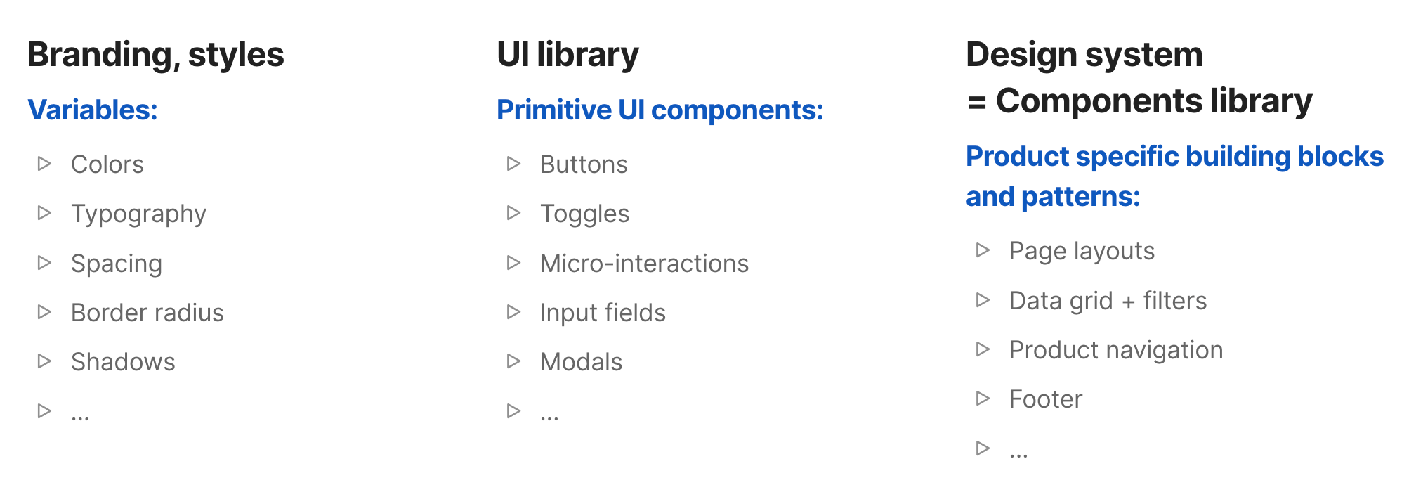
These elements should be consistent and centrally documented, because they become the rules that AI can learn and apply.
Frontend code is built from components, that act like independent and reusable lego blocks. They can be nested one into another, have multiple variants or states. You define your theme variables in one configuration file (e.g., tailwind.config.ts), and components reliably adapt designs to your brand just by editing tokens, without rewriting component logic.
Components are:
- Reusable: You can use the same component in many places, with different data each time
- Nested: Can contain other components, forming a tree structure
Most AI tools come with defaults for a reason
Most AI coding tools assume a React + Tailwind + Shadcn/ui stack. This is not a philosophical stance. It is a training data reality.
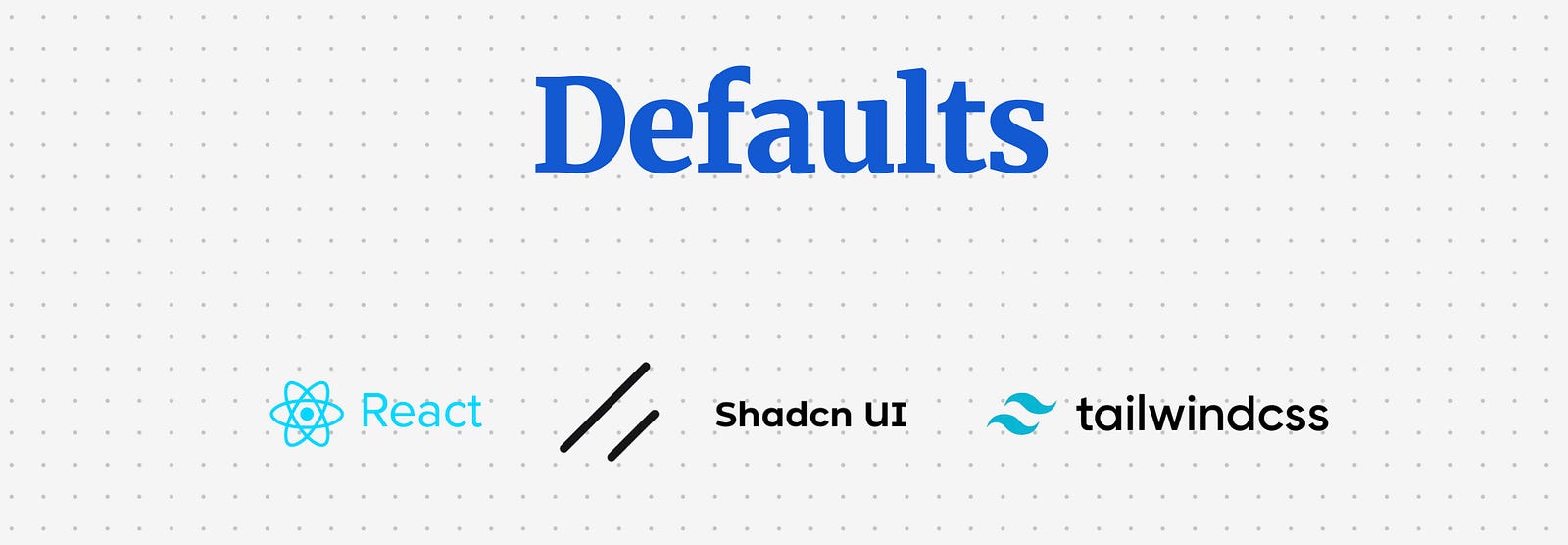
React is the dominant frontend framework.
Tailwind is a utility-first styling system that also acts as a widely adopted token structure for spacing, typography, colour, and layout rules.
shadcn/ui is a set of accessible UI primitives, built for React and styled with Tailwind, where the components live inside your codebase so you can edit them.
Food for thought
Teams that adopted the React + Tailwind + shadcn/ui combo for production code are supercharged to build faster than ever as they can use AI-generated code directly in production, while other teams can only use AI tools for prototyping and must rebuild everything to match their production stack. The speed gap may be growing exponentially, creating dramatic differences in how roles are defined. In teams using AI-generated code in production, designers or PMs can contribute directly to the codebase and collaborate with developers at a much deeper level. In legacy teams, there remains a lengthy and time-consuming handover process, with compromises and details lost in translation.
This also means the amount of training data for the React + Tailwind + shadcn/ui stack will continue to grow, and AI output quality will improve along with it. The question becomes: is it worth migrating to this stack to unlock full-cycle AI coding, or would rewriting existing systems take too long?
How to set up styling variables (design tokens, theme) with Tailwind CSS
Tailwind is one of the most popular token engines we have right now. It’s not a design system by itself, but it gives you a consistent scale for spacing, typography, colour, shadows, breakpoints, and more.
The core idea is simple: you define your theme once (tokens), and every component consumes it. If you do this right, rebranding your prototype becomes a controlled variable change.
Tailwind’s theme is basically a structured dictionary of values:
Raw tokens: concrete values like
#2563eb,16px,0.75remSemantic tokens: names that describe meaning, like
primary,muted,danger,surface,borderComponent usage: utilities like
bg-primary,text-muted-foreground,ring-ringare just ways to reference those tokens consistently
In modern Tailwind setups (especially with shadcn/ui), colour is often managed via CSS variables so you can support theming (light/dark) without rebuilding the entire stylesheet.
Option 1: Tailwind config only (fast, simple, less flexible)
You define your palette and scales directly in tailwind.config.(js|ts) and use utilities like bg-brand-600, text-brand-50.
Best for: full control and flexibility
Downside: theming is harder, labor-intensive, relations to actual usage is not visible
Option 2: Tokens from design tools (Figma exports, token JSON, generators)
You export tokens from Figma or a token manager, then transform them into Tailwind theme + CSS variables.
Best for: quick and dirty tokens export
Downside: if your design tokens naming doesn’t match with Tailwind conventions (ie. brand color vs primary color), the export becomes chaos
Option 3: Theme generators (TweakCN and similar)
You pick a base theme, tweak colours/typography, then copy the theme output and apply it to your Tailwind config via prompting.
Best for: convenient tool for setting and maintaining variables over time.
Downside: custom variables still has to be set up directly in code.
Food for thought
Many design teams have invested in creating complex systems for organizing their design tokens. But does it really make sense when most modern frontend systems use Tailwind? This inconsistency only pushes designers and developers further apart. Rising design tools like Paper are fixing this by integrating Tailwind as a base. Even if you use Figma, consider starting with Tailwind’s variable structure instead of reinventing the wheel.
Here is a quick tutorial how to import Tailwind theme into Figma:
Tailwind Theme → Figma
How to export your Tailwind theme and variables into Figma
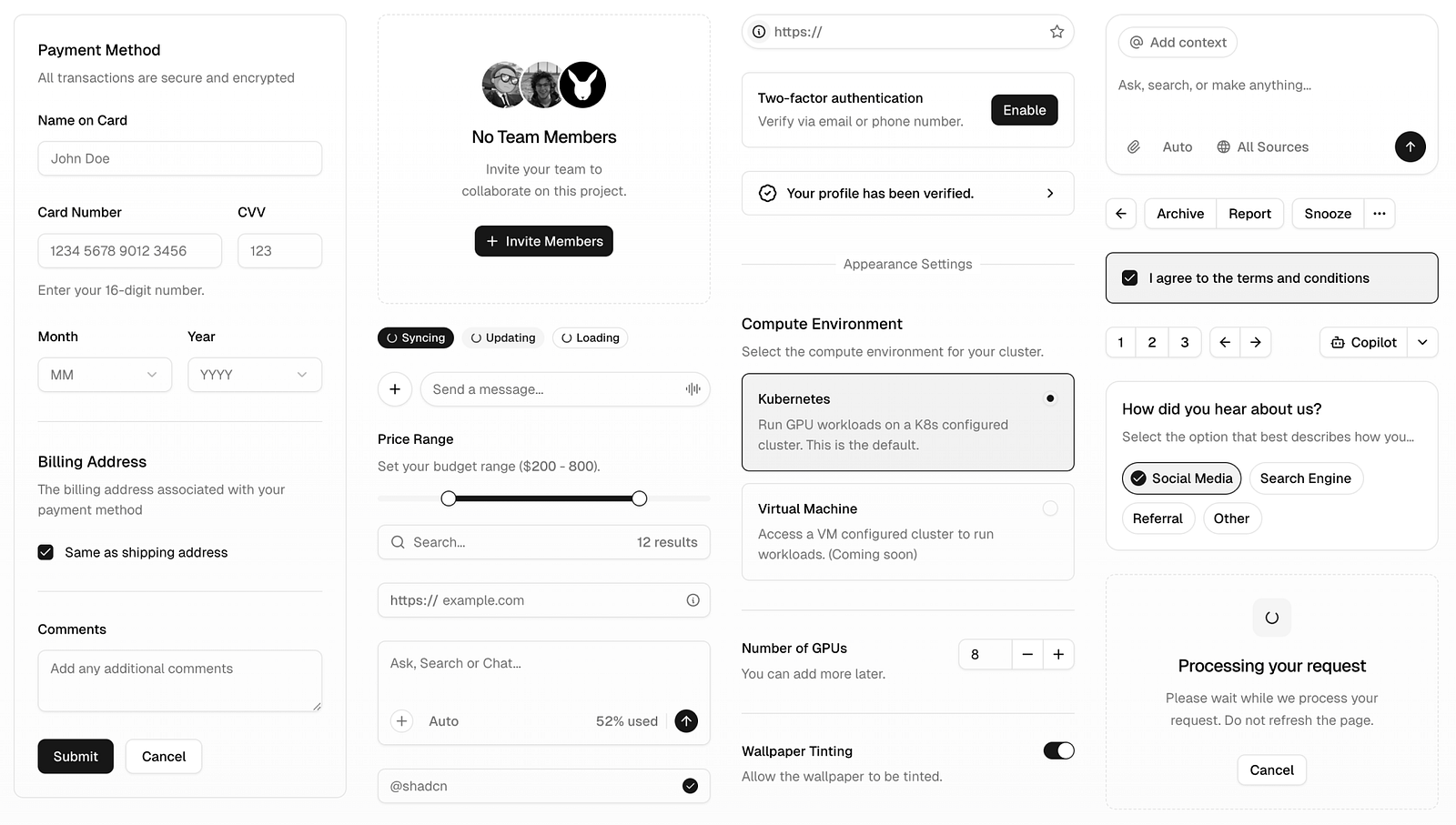
UI primitives with ShadCN
ShadCN is what you reach for when you need actual components — buttons, input fields, modals, dropdowns — the real, tangible pieces of an interface. They’re pre-built, accessible, styled with Tailwind, and designed to slot perfectly into modern React apps.
Other popular UI libraries include MUI by Google, Bootstrap, and Base UI. There are also headless libraries like Radix (used in ShadCN) and React Aria, which come without styling. But these libraries are far less popular with coding agents due to their architecture and the limited training data available. ShadCN is winning this race by a wide margin.
And believe me, you really don’t want to build UI library from scratch. It’s a waste of time, and you’ll almost certainly get accessibility, keyboard navigation, focus states, or micro-interactions wrong. Out-of-box professional libraries handles all of that for you and gives you a rock-solid starting point.
But the truly clever part is how it works. Most libraries (like Bootstrap or MUI) come as big, heavy packages. You install them, and then you’re stuck with their opinions about structure, naming, and design. Customising them often feels like swimming upstream. Plus you have to import the entire package, even when you only need a couple of components.
ShadCN turns this model upside down. Every component is copy-pasted into your project as plain code, you can import only components that you actually need, not the entire library. That means you own it from day one. You can rename, refactor, restyle, or completely break it apart — no fighting with a black box. It’s yours to shape however you like.
And just like Tailwind, ShadCN isn’t just popular, it’s the default in most AI coding tools. That means AI “understands” these components best, which leads to more accurate results and faster prompting. Instead of describing every detail of a button or modal, you can focus on describing the high-level solution (ie “build a checkout flow”), and AI will find the components.
Food for thought
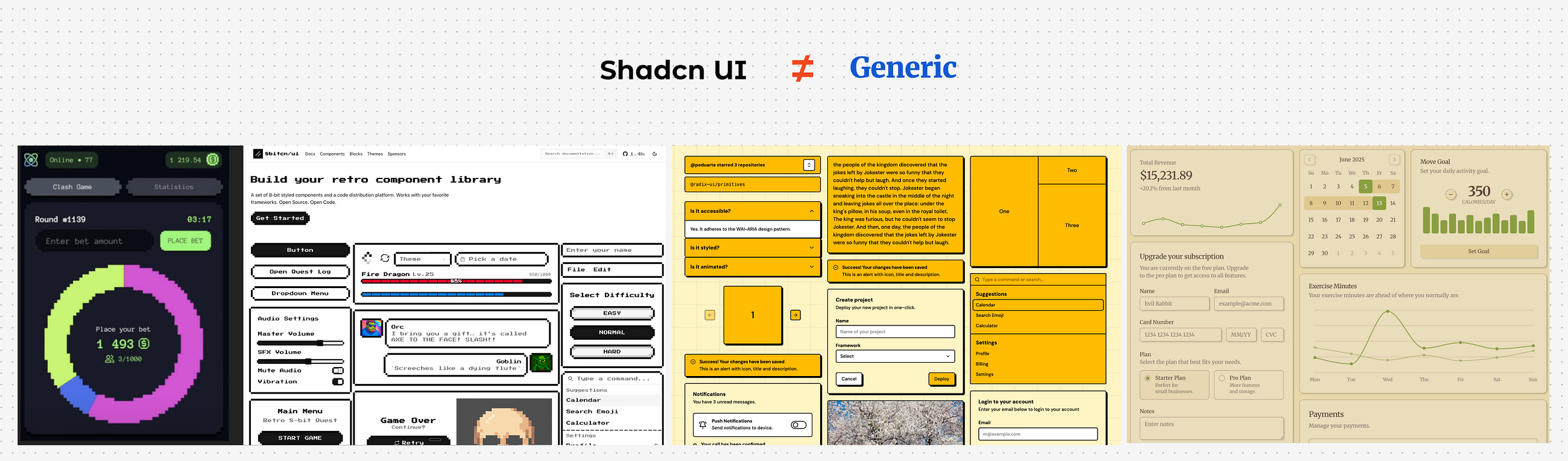
Leverage Familiar Foundations. To get speed and quality, many teams mimic their other UI libraries system with ShadCN components. Thanks to ShadCN being so flexible, you can style it to look like anything — be it MUI or something completely unique. So if AI-generated apps look the same, it’s just because nobody bothered to style them properly. Look at some of the ShadCn themes below.
Adopting other UI libraries.
Alternatively, you can prompt AI to adopt one of the other existing open-source libraries while setting up your project foundations — be it MUI, Bootstrap, Base UI or others. It works, but there are trade-offs: the model’s intuition drops significantly. You need to specify which components to use, which variants, and often how they should behave. Iteration slows down, and prompt complexity increases, and when some AI agents might still fall back to ShadCN if they don’t find a fitting component.
For production codebases this may be acceptable. For fast exploration and cross-functional building, ShadCN remains the most reliable baseline today.
Food for thought
Don’t reinvent the wheel (even in non-AI context). Start with a proven, accessible UI library and build your design system on top of it. Mature libraries give you baseline accessibility and interaction behaviour, and they let you prompt at a higher level because the AI can select the right primitives without you micromanaging every detail.
Building a Design System with Custom Components
Once your styling and primitives are set, it’s time to integrate custom components. Whether your components live in Figma, Storybook, GitHub, or production code, you can bring them into an AI-augmented workflow.
Option 1. Figma as Source
If components live in Figma, use Figma MCP or similar tools like Locofy, Anima, or Builder.io to convert visual designs to code. AI tools can infer function from visuals, but it’s safer to describe each component’s behavior explicitly during the conversion. There is a functionality gap that you should take care of, as Figma doesn’t convey any info about business logic and componentbehaviour. When prompting, include both the visual and a description: “This is a DropdownMenu, it opens on click and supports keyboard navigation.”
I made a thorough comparison of Figma-to-code tools here:
Figma to Code
Build prototypes that match your design — when precision matters
Simpler still: screenshot your components and instruct the AI to replicate layout and behavior using known primitives (ShadCN or your own). For example, “Replicate this screenshot using <Popover> and <Listbox> from our component library.”
Option 2. Source Code Access
If you have code access, paste in source files or component definitions into your AI agent. Specify usage intent (“Use InputEmail for all email fields”) and naming. Cursor, Replit, and Ghostwriter can ingest GitHub repositories to fetch and learn from your codebase. Instruct them to “Use components from this repo only.”
The best practice is to bundle your design system as an NPM package. Once installed in the agent’s environment, the AI can use your components directly. Provide docs or inline comments to teach usage patterns (“Use TagSelector for multi-selects. Avoid native <select>.”).
Keep in mind, AI will not know how to interpret your library from day one, spend time on training it, and provide proper documentation to every component (ideally directly inside the code). Also get ready to be much more specific with prompting. For example, instead of “implement a checkout flow” you might need to prompt like this: “on the step one of the checkout flow show comonent A in variant B”.
Live Documentation as Ground Truth
Documentation is critical. AI only aligns with your system if the documentation is complete and accurate. Create a guidelines.md file — a concise, rule-based doc that includes:
Tokens (naming, values)
Components (APIs, when to use, when not to use)
Rules (“All dialogs must use
<Modal>and support Escape to close”)
This doc acts as executable guidance. Prompt the AI to “follow all rules from [link]” and performance improves dramatically. But beware: if your docs contain errors or inconsistencies, the AI will follow them blindly. Treat docs like code: versioned, reviewed, and tested.
Rollout Strategies, Documentation, and Internal Adoption
Introducing AI-powered design workflows is a cultural shift. Try to use these tactics:
Templates and Starters: Create prototype templates with the design system pre-installed and AI instructions loaded. Let users duplicate these to start.
Constraints for Reliability: Move editable content into config files. Let the AI edit variables, not core logic. Use constants like
layoutType = "wizard".Iterative Training: Regularly evaluate the AI with test prompts (“Build a card with avatar and CTA”). Refine docs and tokens based on where it fails.
Champions and Training: Appoint internal experts. Run AI onboarding sessions. Use events like “AI Prototyping Day” to raise confidence.
Start with Low Stakes: Let teams test AI workflows on internal tools first. Avoid pushing AI-generated code to customer-facing products until quality is proven.
Keep Human in the Loop: Use design reviews, code reviews, and accessibility tests on AI output. Collaborate with developers — it’s a win-win for everyone.
Share Wins: Track time saved, fidelity to design system, and developer feedback. Share case studies to encourage adoption.
Conclusion
A design system isn’t just the backbone of modern product development anymore, it is an internal asset that empowers builders across the entire organization. Give it the importance it deserves! In the age of AI prototyping and vibe-coding, is it more essential than ever. Your design system is no longer just a reference for humans — it’s the rulebook for AI coding agents. The clearer and more structured your tokens, components, and documentation, the better AI will build on-brand, accessible, usable interfaces, the faster people can build new products, prototypes, internal tools and make the wildest ideas see the light of day.
Want to actually use this stuff, not just nod along politely
If the article resonated, here are two ways to turn “design systems + AI” from a concept into a muscle your team can actually use.
1) AI Prototyping for Product Designers
This is for product designers (and design-adjacent builders) who want to ship functional prototypes that respect real constraints: design tokens, component libraries, data, and messy edge cases.
You will learn how to:
set up styling variables properly (Tailwind theme, CSS variables, shadcn/ui theming patterns), build and import components
build real products with backend, databases, and complex flows
prototype AI-powered functionality
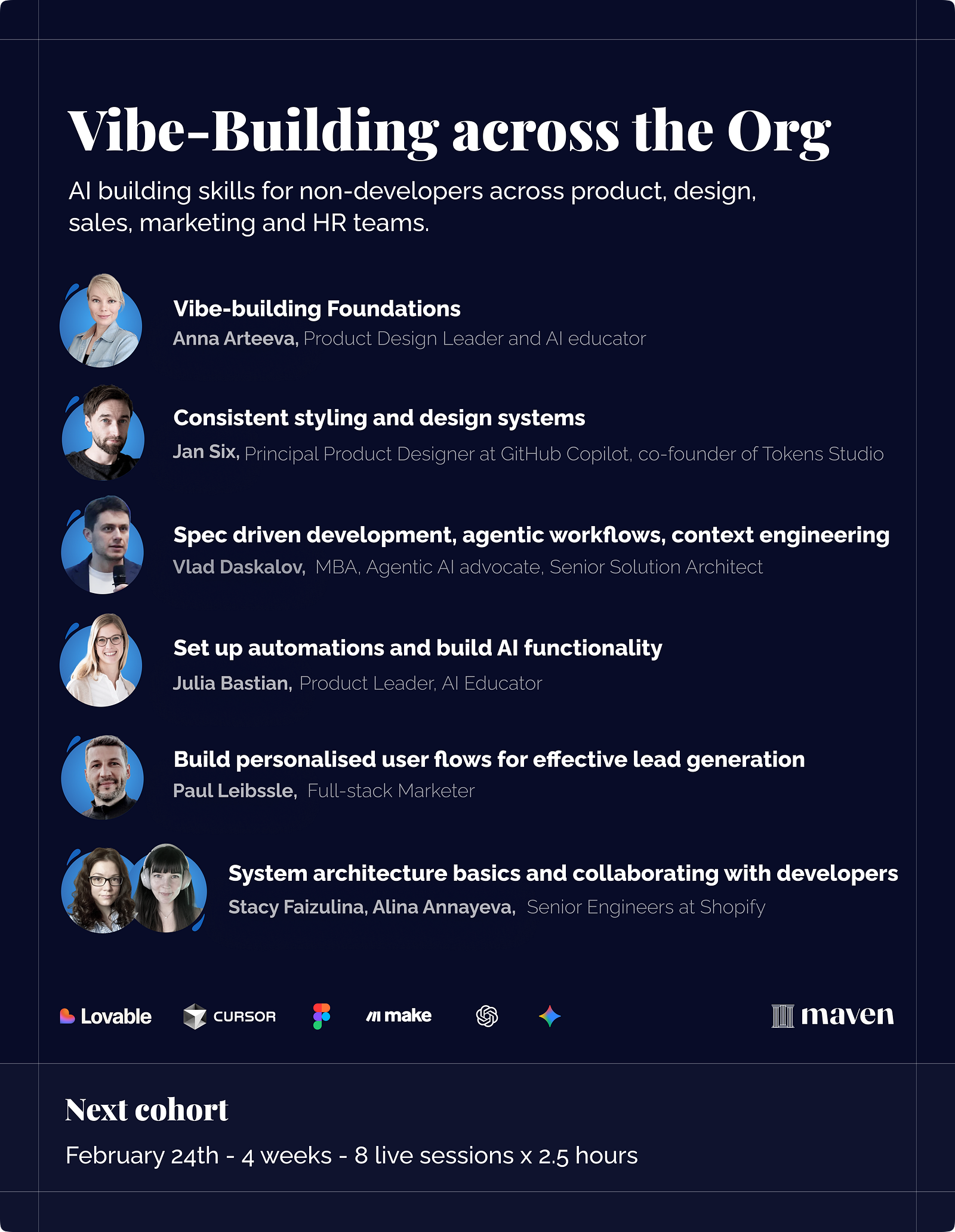
2) Vibe-Building across the Org
This is the “builders across the company” version. Same ambition (build real things), but designed for cross-functional teams: product, design, ops, marketing, sales, HR. The goal is consistency at scale, so people can move fast without shipping Franken-UI.
You will cover:
foundations of vibe-building (how to think in components, data, flows)
consistent styling and design systems (so everything looks like it belongs)
spec-driven development, agentic workflows, context engineering (less chaos, more repeatability)
automations and AI functionality (Make and friends)
personalised user flows for lead gen
system architecture basics and collaborating with developers (so prototypes do not implode on contact with reality)